 Google is now hosting GapMinder, it's new tech acquisition that shows the distribution of the wealth of nations.
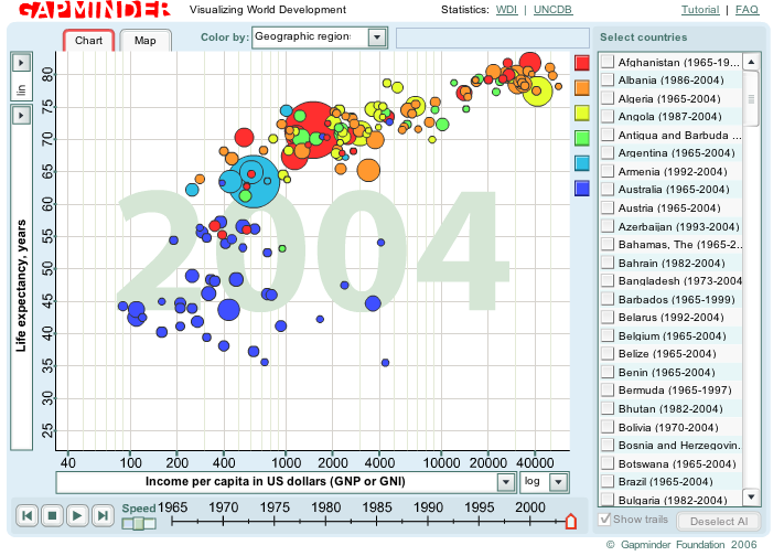
One can choose to see the chart or map of all or select countries for the following variables (below) between 1965 and today. In addition, the timeline can be played as a video as well as manually selected. The circular area colors can be changed to represent population, geographic regions or indebtedness.
Google also integrated GapMinder data into its new Co-op subscriber community. This, says the GapMinder site, "makes it possible to search deep into GapMinder's moving graphs visualizing world development."
Where was this when I was an undergrad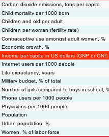 researching comparative, international political economic papers? Actually, this is one of the best things Google could explicitly do for "humanitarian" efforts. International consciousness of global strangers' standards of living is difficult to cultivate. It takes a slow learning, historically dependent on a haphazard pattern of interaction.
This does not need to lead to westerners turning-out their pockets for the third-world in order to do great good. Simply inspiring normal, localized citizens to think about the larger economic and social community in which they live and operate in is valuable--especially as we all become more interdependent. Optimistically, one might hope that the profusion of such comparative information (complexity simplified) might lead to some international team spirit. And that need not conflict with global competition, but rather complement it.
NB: I can't believe Infosthetics hasn't jumped all over this yet (probably has better toys to blog with). Still, it did note GapMinder last year when it was graphing for the United Nations Development Project-- always worth a peak.
12.5.06
GapMinder
Posted by melanie at 12:31 AM
Subscribe to:
Post Comments (Atom)


0 Comments:
Post a Comment