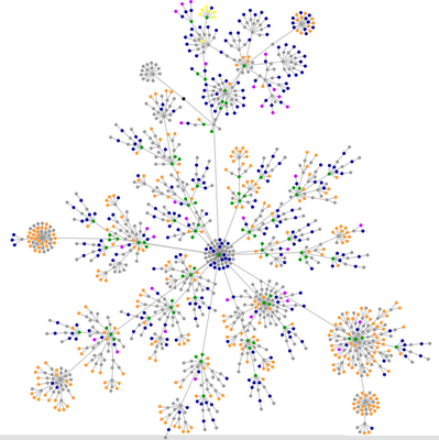
 Enter a url and this applet will unfold a colorful diagram of the site's tag structure. Very nice. The simpler the better, so goes the KISS motto (keep it simple stupid).
By those standards this site isn't getting any love. More complexity however makes the visualization prettier---adding more layers of colorful dors to the fanned tree. So the worse, the better.
KEY: What do the colors mean?
blue: for links (the A tag)
red: for tables (TABLE, TR and TD tags)
green: for the DIV tag
violet: for images (the IMG tag)
yellow: for forms (FORM, INPUT, TEXTAREA, SELECT and OPTION tags)
orange: for linebreaks and blockquotes (BR, P, and BLOCKQUOTE tags)
black: the HTML tag, the root node
gray: all other tags
A note if you try this: My site's diagram never seemed to stop unravelling with new layers. The applet will pause for a few seconds then begin again--so be patient, just a warning.
Hint: Don't mess with your Firefox toolbar extensions while the applet is loading. I crashed the browser three times, losing this stupid post. Damn, what I do for my devoted legion of fans.
Link to the tag-structure applet.
Thre creator examines some the structure of some popular sites (like Google, BoingBoing, Wired).
Some people are uploading pictures of their site diagrams onto Flickr.
28.5.06
The worse, the better!
Posted by melanie at 8:31 PM
Subscribe to:
Post Comments (Atom)


0 Comments:
Post a Comment