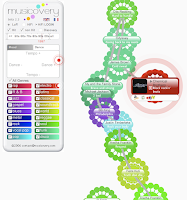
 Musicovery: what's good, what's bad-- because it's so fun reviewing free products.
Music visualization floats my boat, but Musicovery is way more than that. It's a music finder with very select tunes-- yes, those cherry-picked from Amazon, iTunes and Ebay stores-- but also fit into a net of relationships.
Starting-off in the mood categorizer, you select a ratio around variables of energy and tempo. I fumbled a bit, trying to track its criteria for songs, as I selected and deselected genres and watched the chain of colorful pinwheels bounce-out. The bridges between songs are relatively justified--skipping lakes perhaps, but not oceans.
To test my understanding of the system, I tried to stumble upon my favorite artists. I think I got very close but (helas!) the experiment was to no avail and misleading. The music library is sufficiently bare not to cover my favorites, which are somewhat fringe in comparison to the billboard charts at large. But it works well for pop, rap and more popular music genres.
Hey, I was happy they had Daft Punk. So much of it, in fact, that--to their credit-- it was frequently associated with itself. Now, I know Daft Punk is unique, but they do have contemporaries... a grouping that does not include Will Smith's "Men in Black" (or should not).
One of the better features is its dance playlist creation tool. If you're throwing a rug-cutter, you can trust this two axis spectrum of dance-ability and tempo to pull you a list. That's handy. Heck, it's also comforting to know there's some (supposed) arbitrary measure of dance-ability for a song.
Also good: the association between songs of different genres are made visual by placement, linking, and color. Not only is it clear, but the dynamic display is fun. Okay, so the splatter-paint track frames are a little hideous by my standards; still, I can see that they look festive.
What I'd like to see:
#1 (of course) More Music
Obviously, more songs in there to choose from. More data is always more interesting, and useful.
#2 Oops button
When you select any particular song on the association map, the whole map reconfigures around that song-- meaning that you've lost the family of similar tracks for the previous song. It'd be nice to be able to "go back" to your previous song. It would make the discovery process more satisfying because you could build your knowledge and refine your choices faster.
#3 Indie
As I said above, Musicovery does a great job with pop culture music but more representation of smaller but prominent genres is worthwhile. I noticed as missing: indie and folk. There's also a huge range in "electro" music; they need to differentiate between trance, house, experimental, and others. "World" is also just a tad obtuse.
#4 Lose the Skittles Colors
I want to taste the rainbow, not see it pulsing in front of me.
#5 Widget
Make a downloadable player.
#6 Make friends
This would be way cooler if it already worked with all the social music data I've already compiled on other platforms. I wish I could play this game using imported data from my Last.fm profile, or see them hook-up with Pandora. If not with my Last.fm songs, then at least with my mac iTunes library.
#8 Combine
I like the music selection tools and I like the dynamic music map display. But, the way it's presented now, they look like two unassociated pieces: a calculator and a coloring book. um, OK? Create a frame around the whole apparatus. Or, better, change it up entirely so it's integrated.
#9 Tell Us More
Similarly, I'd like to know how they determine the association between the songs--man-made, computer-determined, combo? Who is this Musicovery group, do they have funding?
#10 Please Discriminate Against Lefties, With the Rest of Us
Also, remember people are mostly right-handed. As with scroll bars, the selection controls should be relocated to the right-side. Better yet, allow the user to move the controls.
5.7.07
music visualization floats my boat
Posted by melanie at 11:58 PM
Subscribe to:
Post Comments (Atom)


0 Comments:
Post a Comment